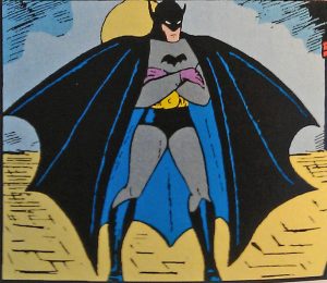
Yeah, that’s right. That’s Batman (or the Bat-Man as he’s called in the story here), the creature of the night. The Dark Knight Detective. The Caped Crusader with his jaunty purple gloves and really awkward looking wings/cape. And… ears. Those weird ears…

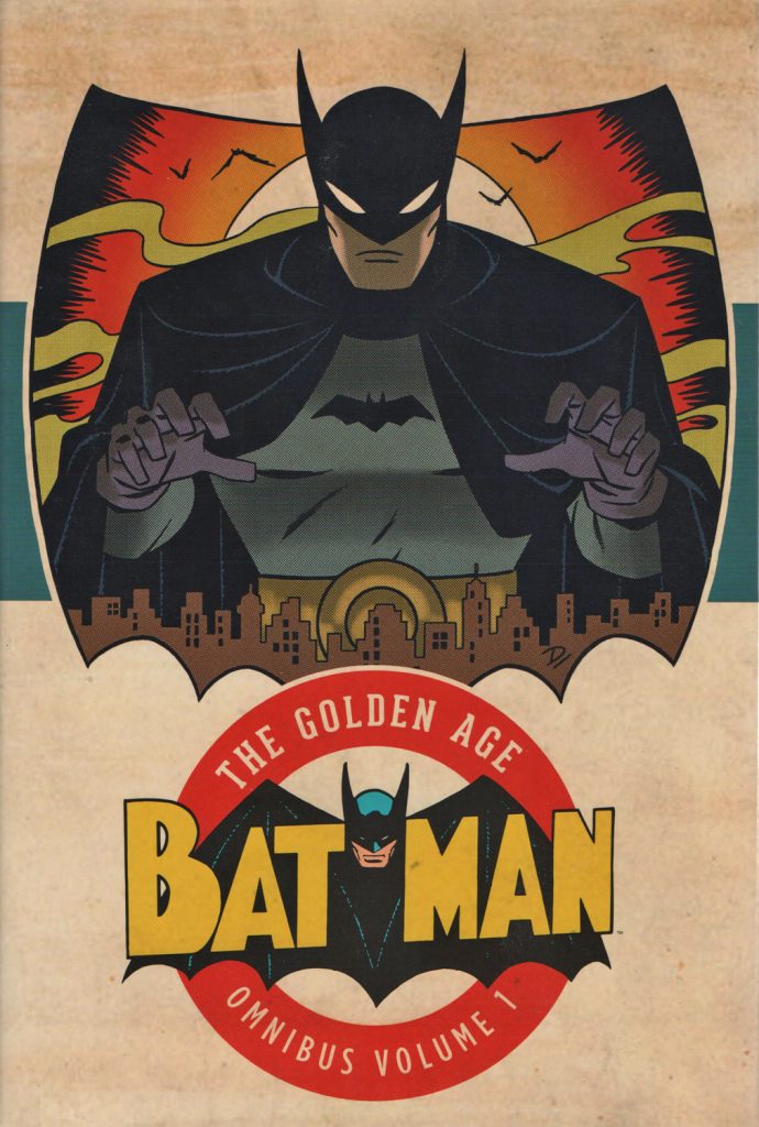
Anyway, after the first appearance of Superman in Action Comics #1, the next obvious port of call in my read through is Batman’s very first appearance. This is by way of the Golden Age Batman Omnibus Vol. 1 (of eight volumes and counting no less!).
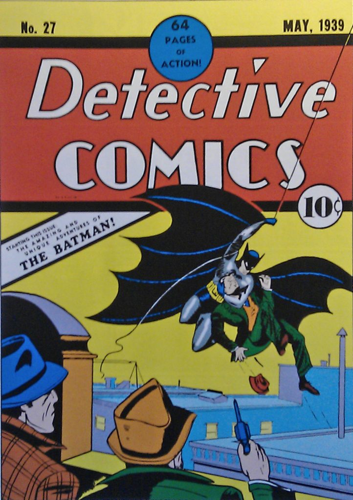
Unlike Superman’s first appearance neatly being in the first issue of Action Comics, Batman’s first appearance is in #27 of the ongoing Detective Comics.
The story goes that after the success of Superman a year earlier in 1938, DC was fishing around for another superhero character. Bob Kane was given the job and came up with the basic concept of Batman. Writer Bill Finger filled out the details and to their credit, they came up with someone who is in a lot of ways a complete contrast to Superman.
(This cuts the proverbial long story short. The creation of Batman is quite a controversial area with Bob Kane having covered up Bill Finger’s contributions for years.)
Holy Cover Swipe Batman!

The cover to Detective Comics #27 is of course now iconic and to my untrained eye, really good. Certainly a contrast to Bob Kane’s more rudimentary interior art. Even here however there’s controversy. It seems that Bob Kane swiped the figure for Batman from Alex Raymond’s Flash Gordon comic strip.
(This page at Wikipedia has a great overview of ‘swiping’ in comics.)
Sticking with Bob Kane’s art, I can never decide whether it was a case of simply being heavily stylised or whether he just could not draw very well! Even if you give it the benefit of the doubt – the restoration in the Omnibus isn’t exactly stellar – the art in Batman’s first outing is very crude.
However, sometimes you just have to remember that this is right at the beginning. Not just of superhero comics but comic books in general. Almost everyone was learning as they went along!
“The Case of the Chemical Syndicate”
The story itself, “The Case of the Chemical Syndicate”, is short at just six pages but a lot is crammed in. There’s a bit of a whodunit to the story, a trap, a shady laboratory and of course, the beginnings of Batman’s mythology.
I always find it fun seeing which elements were there at the beginning and which took time to develop. Commissioner Gordon is there right at the start, as a friend of Bruce Wayne. Talking of Bruce, he’s depicted as playing the part of a lazy socialite as a cover for his alter ego. So that aspect is there from the start but it is pretty much all the detail we get. Golden Age stories didn’t worry about origins until characters were proven! In fact readers weren’t treated to Batman’s origin until Detective Comics #33.
In such a short story, there isn’t room for much development of course. It’s incredible however that a lot of the essential elements of Batman’s design are there. The costume gets refined (the purple gloves are replaced, the placement of the ears are fixed) but it’s essentially the same overall look that’s used up until the early 1960s.
Comparing this debut with Superman’s, I feel that Superman himself appeared on the page much more fully formed. Batman takes a bit more time to develop. This in fact happens over the next twelve months with the addition of bat-themed gadgets, an expanding rogues gallery and of course a certain Boy Wonder.

